It doesn’t seem like all that long ago to me that The Legend of Zelda: The Comic Strip (the now quite-antiquated full name) looked like what you see above. I had done very little with Photoshop at the time, except for a few mouse drawings of Nintendo characters, so it’s safe to say I didn’t know what the hell I was doing. As mentioned in the FAQ, I had been very quickly and heavily inspired by 8-Bit Theater, the first sprite comic I had ever seen, so I was in quite the hurry to make my own Zelda II-themed project lickety-split. Looking back now, I can spot quite a few mistakes I made:
- I used to make the panels 250×250 pixels, then shrink them to 225×225 when I put them in the comic. Please don’t ask me why I did this, because I have no damn clue. It’s one of the most nonsensical things I’ve ever done with this comic (besides the rancor’s cameo, anyway)
- The comic has a transparent background. I think I originally did this because I thought it would make smaller files (ah, ignorant youth; transparency is a color when it comes to images, so it would have been the same file size with any solid color). The biggest problem is readily apparent with the title and episode number information; at that level of GIF compression, the characters become blocky and a little difficult to read. It’s probably worth a few extra bytes of data to give the image more colors to have more anti-aliased text and get a more legible result.
- Mouse-drawn word bubbles?!? The less said about this, the better. Same goes for the Zelda I title image in a Zelda II comic.
- The sweatdrop (besides being a way overused carryover from Japanese animation) would have looked a lot better in sprite form. Same goes for the telephone in the next episode, and the crapload of drawings in the one after that.
- Main characters ought to have faces. I’m glad I figured this out eventually.
And now, a few things you may not have known about Zelda Comic. Were you aware that:
- Zelda Comic was originally a small subsection of my Geocities site, “It’sa Me, Mario”? (thanks to my packrat nature, I’ve got the whole original site saved on my computer. The entire site consisted of three drawings, four “rants”, a handful of links, and a section detailing when I made updates to the site. So even in its early primitive state, Zelda Comic was a major step up in site content)
- there was no pre-planned plot for several months after starting the comic, and that each episode was written as it was being constructed, moments before uploading? (this included Pit and Bub being characters)
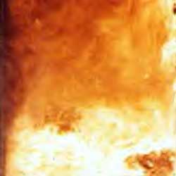
- the fire image used in the background of episode 3 is almost the only image I use for fires in Zelda Comic, and in fact in any other comic where I need a background engulfed in flames? (want it?)
- I sent Brian Clevinger an e-mail asking him for permission to make a sprite comic? (I feel so embarrassed saying that now. Maybe I thought he was the rightful inventor of the idea? Long story short, he did indeed give me permission)
- I had never played Kid Icarus before putting Pit in the comic? (Paul was a fan of the game, and I thought the sprite looked cool, so I checked out the ROM, quickly took some screenshots and threw him in. Die-hard Pit fans, please feel free to shun me a little bit. But hey, I’m a big fan now, and just bought the game on Virtual Console, so that’s gotta count for something!)
I think that’s enough embarrassing confessions for now. I leave you with a special treat: an early version of the Zelda Comic website courtesy of archive.org! You can check out all the archives they’ve got here (GameRoom), here (Zelda Universe), and here (self-hosted)!
Holy crap, I’ve been using the blue site design for over three years now! In case you haven’t noticed yet, I’m doing a bit of retooling along those lines. Like I said on Monday, nothing earth-shattering, but mostly a color rethinking that’s been a long time coming; in fact, the comic background color change last year was made specifically in preparation for a brown website. The blue was fun and all, but the comic’s colors pop out a hell of a lot better against a more neutral background. Blue was getting a little garish. The biggest change would be the retooled title bar, designed to make much more efficient use of vertical space. I’ll be refreshing the non-main pages soon enough to reflect this design shift, but I’m thinking of calling it a night soon, and will be out of town for a large chunk of Saturday, so the rest of the site may be slow to update.
Thanks to everyone for sticking with me for the past five years! You’ve put up with crappy update schedules, fits of writing myself into a corner, and seeing a male Blooper in drag! You all rock my world!


) Your Reply...